


Why Would Anyone Make This 'Tool'?
It's a valid question, and something I've asked myself a few times.. I've explained it a bit here for anyone who interested in getting in the mind of the person behind this very niche creation.
First thing's first
I use the bookmarks bar properly in browsers.
Everything has its place, its section, its folder; there are even naming conventions (to an extent). While I've been told plenty of times that it's over the top, it's exactly what the toolbar is for - keeping your frequented sites organised and within easy reach..
Some back story
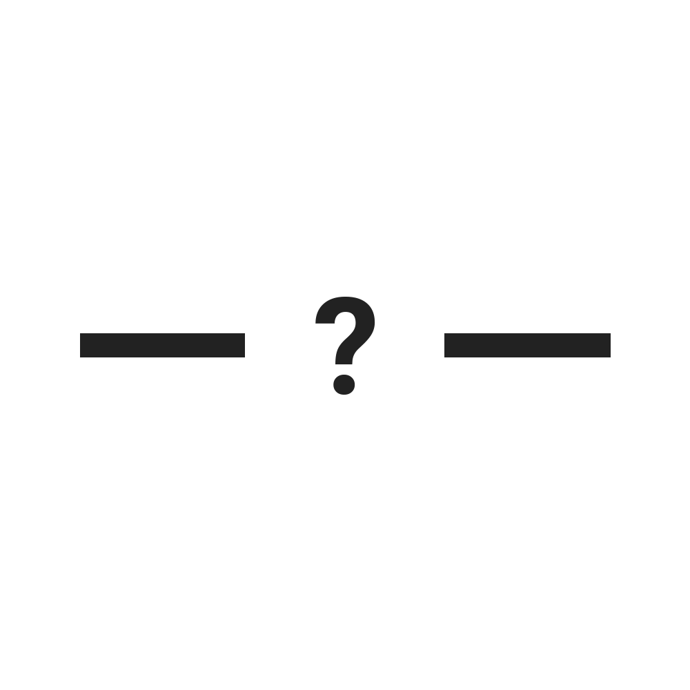
A few years back, I decided I wanted to take this a step further. I wanted to add a separator between my bookmarks to section off each group of sites. Why would anyone want to do this?
Yeah.. a valid question.
I wanted to neated up my toolbar. Despite it being nicely laid out - each item in its proper place - they were too squashed. There was no room to breathe. The groups and sections were merging into each other and it wasn't easy to distiguish between where one group started and another began. This made more annoying when inevitably the favicons fall out of your cache and become a little blank page icon. It's a tough life, huh..
As any reasonable person would, I Googled it.
The problem, a solution, another problem, and another solution
If you've come this far and are reading this, I probably don't need to tell you that there are options out there. A few actually.
It was a bit of a (albeit short-lived) rollercoaster at this point:
Initially, I was disappointed that there was no native Chrome functionality to handle this (this site is actually one of two times I've fixed Google's UI). Firefox have this feature in their browser, but I read that Google have no plans to add it, with it being such a niche addition that most won't use. Fair enough..
I was quickly uplifted by being pointed in the direction of a workaround. The site in question used a very clever and simple little trick of utilising the favicon of a page. This, combined with an unnamed bookmark, produced an almost-perfect result. I put the separators into place and cracked on with my life. Problem solved!
There was another problem though..
It was just a bit shit.. don't get me wrong, the workaround was a nice little trick - I was happy with that aspect. It seemed like it was the best way to go (still does/is, to my knowledge). The separator itself was just a bit limited.
Grey, boring, uninteresting, generally just a bit... shit. (Sorry, manski83 - genuinely no offence)
I went back to Google and searched again. There was another strong alternative someone had made. This one was a bit cooler, had a bit more character (is any of this really 'cool'? Probably not..).
The latest separator tool I found was the same idea - it used a favicon that you saved as an unnamed bookmark that added a little vertical pipe icon between bookmarks. This one had colours to choose from, even a horizontal line if you wanted - nice!
This was my new separator tool. I removed all the old separators I'd put in place, chose my colour carefully (black.. very creative), and threw a few in my bookmarks bar.
This solved my problem for quite a while. A good few months. If we're being honest, the 'problem' was already solved with the first tool I found, this just satisfied my wanting for extra customisation for a little while longer.
There did, however, come a point where I decided I could do better.
I'll do it myself
I have, in the past, referred to myself as someone who enjoys to build small, very niche 'web tools' for very specific purposes. For some reason, I decided this was one of the niche tools I wanted to build. I'd had a few ideas of what I wanted to be able to do with it (really there's only one function, but you know..) and made some notes.
This tool would be the best of the bunch. I was going to blow the competition out of the water.
This was my first project in PHP (can you tell?!), so I told myself it was a learning exercise if nothing else.
I got to work.
I first needed to figure out how the favicon system worked. The annoying thing about PHP (as well as the beauty of it) is that it's what's called a 'server-side' language, meaning you can't steal people's code to use for your own.
Damn. That's my bread and butter.
Some hours later, spent trawling Stack Overflow, mixed with much trial and error, I got it figured out and working. I won't bore you with the details because it's most likely that you're not interested in PHP or programming, but let me tell you - I was happy with myself.
Now for the icons
This was actually both fun and dull. It was a longer process than I had anticipated. I didn't want to just steal icons or fonts from somewhere, they needed to be my own creation to save getting caught for copyright theft or something. It was fun at first, but started to wear thin after about 20 or so icons (only 60ish to go!)
There was no real thought behind which icons I was making, I just looked at my keyboard and thought about which icons would make good separators. The 'pipe' was the obvious one, as was the hyphen. They'd already been done though; I wanted to get at least a bit more creative than that. I added a 'dot', various brackets and a couple of slashes - they seemed like good choices - along with my favourite, the blank spacer.
I picked the colours I'd use; as someone who's colourblind, I only really go by the 'top-level' colours, i.e. "red", "blue" etc. I don't often delve into the realms of "duck egg" or "sea grass". This is evident in the colour selections I've made. It was also helped by the Materialize colour palette giving me access to easy premade and reusable colours. I figured that was all good though, they cover most bases.
It's time
The tool was ready to go live.
Time to send it out into the world. I did some basic SEO on the site and within no time it started to show up in Google for "Chrome bookmark separators" searches and the like. Awesome! It's always a good feeling when your site turns up on page 1 in Google for your main searches. I'd set myself a fairly easy task here since there was very little competition. The existing tools are digging in though, they're still outranking me. I'll get there..
Anyway, enough about the creation of these separators. If you're on desktop, go check them out (they work fine on mobile, but really they're designed for the desktop toolbar), organise your bookmarks, get creative. Let me know if you use them and anything else I could add - there's a little pop up that appears when you've been on the site a while, I read every single response and it helps a lot, even the negatives. I might set up an email address at some point so people can send me screenshots of how they use them. That's actually a pretty good idea, I might do it sooner rather than later.
More?
I've enjoyed this project so far, so I'll add more to it. I still have ideas that haven't been used yet. I should also set up an email account in case people want to get in touch for any reason. For now, use the Hotjar pop up - I'd love your feedback.