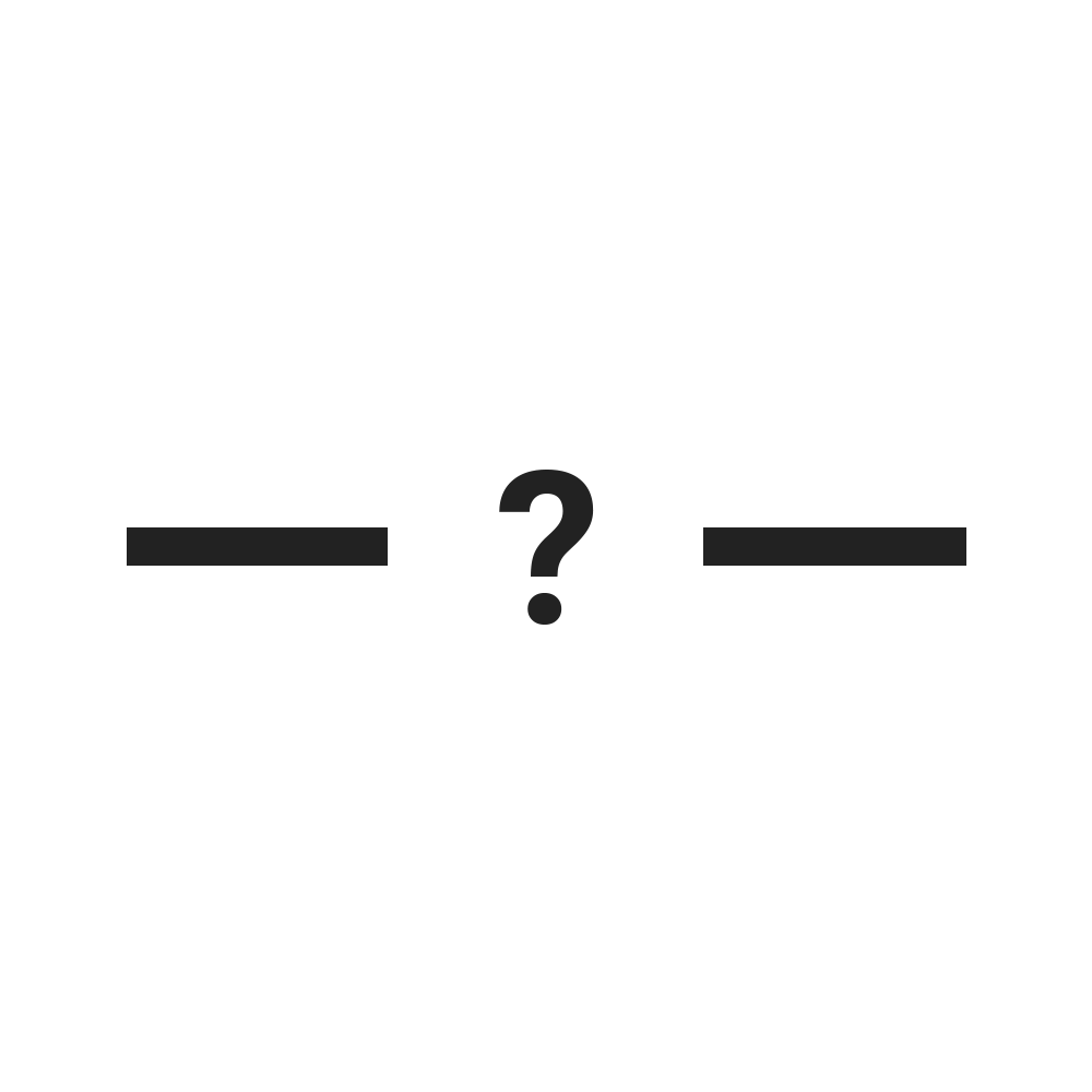
Bookmark Folder Separators
It took a while, but I finally added them
New Stuff First
Here's the new stuff I added:
+ Added folder separators
+ Added up arrow icon
+ Added down arrow icon
+ Added left arrow icon
+ Added right arrow icon
Some other stuff I did:
* New menu layout
* New homepage layout and content
* Tracking improvements - I now know which icons you're using
* More behind the scenes improvements and tweaks (metadata, code cleans etc.)
Folder Separators - Finally!
It was a headache, but it was worth it
As the titles and subtitles of this page suggest, the folder separators I mentioned last time I posted have finally been added!
There are currently 8 variations of the folder separators - solid (I think this might be my favourite), dashed, double-dashed, arrow, arrow out, arrow in, stars and a blank spacer. There aren't any different colours as it isn't possible unfortunately (or fortunately, depending on which side of the fence you sit). No colour options also means that these work on any browser theme, whether dark, light or outrageously colourful.
They're very easy to use, just like the other separators, just pick the one you want, drag it over to a bookmarks folder, wait for that folder to open and drop it in the position you want it. You can use as many as you want, either the same or different, so get creative!
Nerd stuff
Most of this site is built on PHP, but there were issues with how the separators displayed if I used PHP (namely, they didn't display at all), so I've used some jQuery trickery. It works great! The SEO in me is questioning the crawlability and indexability of the pages, but time will tell if that's going to be an issue - that's a problem for future me.
New Icons!
Thanks for the suggestions
If you've been on this site for a minute or two, you've likely seen the little popup box at the bottom of the window. Despite this being a potential annoyance, I use it to collect some very non-invasive feedback from users. 2 simple things:
- Do you / will you use this tool?
- What else would you like to see added?
And
While a lot of people will have become accustomed to these 'annoying popups', contrary to popular belief, they can actually be used to help improve products and services (who knew?!).
I use the info collected from that little popup box to help get new ideas for icons and to make sure I'm giving people what they want. One of the suggestions I had was to add arrow icons - nice one, I hadn't thought of that, and it makes so much sense - so I added them! I've gone with up, down, left and right arrows for now, whether or not I'll dive into diagonals is yet to be determined (let me know if you want to see them!)
Another piece of feedback I had was from someone saying they wouldn't use my tool as it didn't have what they were looking for - a horizontal folder separator. Hence me wanting to get that part sorted sooner rather than later.
If you've replied to that popup, and are currently reading this, thanks for taking the 10 seconds it takes to submit that form! It's genuinely helpful.
I'm Watching You
But not in a creepy way
As briefly mentioned above, I added a new little piece of tracking magic so I can see which icons peopple are using. While I use Google Analytics to track usage of the site, I struggled with figuring out how to tell if people are actually using the separators or not. While Analytics will tell me which pages are most viewed or had the most time spent on them and all kinds of useful stuff like that, it won't tell me when someone has actually used one of the separators, i.e. bookmarked a page.
My job has me using Analytics on a daily basis and, as far as I know, there isn't a way to track if someone bookmarked a page, so I needed to get creative. While I won't bore you with the technical ins and outs, I figured out a way to track when someone drags an icon. While this is far from fool proof, it's a fairly good indicator of which icons are being used. I might post up some stats on which are the most popular icons in the future.
UI Improvements
Now with more ease-of-use!
I've toyed with the idea of a new menu for a while. It's given me some headaches in the past with things not working as expected, but I decided to give it another go. I think it turned out pretty nicely. Cleaner, grouped by type (kinda), easier to read and now mobile friendly (happy now, Google?).
Since I was feeling proud of my new menu and icon additions, I decided to update the homepage and highliught some USPs. Since I'm of the belief that this is the best Chrome bookmark separator tool (now there's a claim to fame, hey?!) I wanted to make the homepage a little more reflective of that, and point out some of the site's key features. As you may have spotted already, there are now way over 200 separators available on this site (what mad man would spend their time creating so many?!) and I wanted to highlight that. My main competitors are in the measly low-double-digits at best (I feel a bookmark separator war coming on).
Final thoughts
I'll assume that you've already had a look at what's available on this site, but if you haven't, the fact that you're here tells me you'd probably quite like what's available. Have a look around, organise your bookmarks bar and don't forget to fill in the popup to give me some feedback and ideas.
Thanks!


