


++icons
New icons, new menu
New stuff:
I made some stuff and fixed some other stuff
+ Added pick your own colour double pipe icon
+ Added pick your own colour dot icon
+ Added heart icon
+ Added star icon
+ Added triangle icon
+ Added square icon
+ Added rose icon
+ Added lightning bolt icon
Improvements:
* Improved the navigation structure (better naming conventions, better layouts, easier to find what you want)
* Fixed some layout issues that had popped up from lazy edits
* Mobile users will now see a banner to advise them that this site is really built for desktop users
It's been a while
It's not easy being a Chrome bookmark separator tycoon
I haven't made any changes to the site for probably coming up a year. It's not that I forgot about it, but things were ticking along nicely and I didn't need to disturb the peace. "Don't fix it if it ain't broke" comes to mind. Only it turns out it was broke. I'm not sure when or how the layout issues happened, but some pages were displaying a little weird. I swapped hosting providers a few months back and I think my lazy migration caused a few issues that flew under the radar for a while. As far as I can see they've been found and fixed now.
Any breakthroughs?
Spoiler: not really
I spent a little time learning how to make better colour picker icons beyond just the basic pipe icon I was so proud of a few months ago. There's now a double pipe and dot icon colour pickers, which are pretty cool if I say so myself.
I decided on those as they're the most popular by a long way. Dot, pipe and double pipe make up the majority of separators people use. As well as the numbers telling me people like these, I also have a little popup poll that shows to new users. This poll has collected a ton of ideas for new icons, and a common request is custom HEX colours. Well, these already existed for the pipe icon, and is pretty popular so I figured people likely wanted it for other styles - more to come.
Thanks for the suggestions
Ask and you shall receive
A nice segue into my next point: I added some new icons. As noted above, I've had loads of requests for new icons, and got a solid list of ideas to work through. A common request (outside of custom colours) was both stars and hearts:
Consider your wishes granted. That is.. as long as this is what you were wishing for..
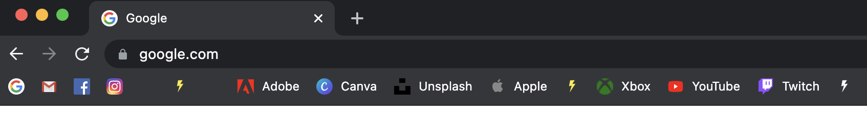
I added more than just the hearts and stars. There are also a couple of basic shapes, as well as a flower and lightning bolt icon, which look pretty cool used as separators. You can see a quick example below:
New menu layout
Now with rainbow text
Looking at the numbers and comparing them with the comments and suggestions I receive, something wasn't quite lining up. I had a fair number of requests coming in for 'pick your own colour' etc - probably more than any other suggestion. Well, as I mentioned above, that's existed for a while now for the simple pipe icon. My hypothesis is that the menu wasn't very helpful in aiding people find the extras beyond the basics; they were likely being missed.
I've taken said hypothesis and run with it, based on close to no other information or insight. I'll review again in a few weeks and see if it's made much of a difference. No doubt the addition of extra icons to this set of separators will help make it stand out more as well.
Next up
Eh.. we'll see
I dunno what's next. I have a list of icons I want to work on, and might start to create some more colour pickers. Like I said, it's not easy being a Chrome bookmark seaprator tycoon...